Applying Color Harmony to GIF Designs
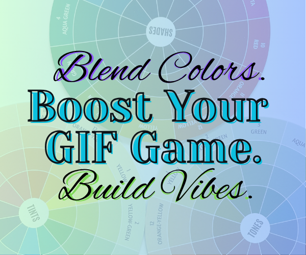
Creating eye-catching GIFs isn’t just about animation—it’s about color harmony. This post covers how to apply classic color schemes to make your GIFs pop.
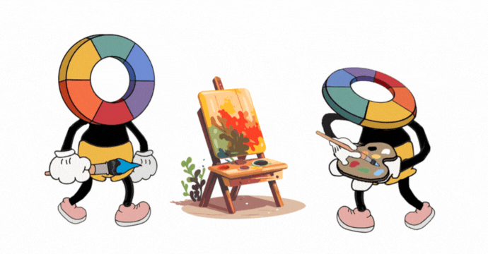
1. Choose a harmony scheme
Complementary schemes create contrast; analogous schemes deliver cohesion; triadic adds vibrant balance.
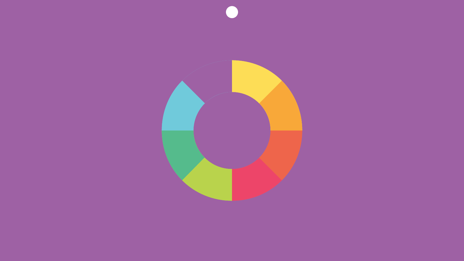
2. Select your base colors
Use a color wheel tool to pick your base hue, then derive the other colors based on your chosen scheme.
3. Apply in your GIF
Use your GIF Color Changer to swap frames’ dominant colors with your palette, preserving animation timing.
4. Test and iterate
Preview your GIF against different backgrounds to check visibility and mood.
5. Use-case examples
- Branded GIFs: Use brand hues + complementary accent.
- Seasonal themes: Analogous warm or cool tones.
- Educational charts: Use triadic for clarity.
Wrap-up
Applying color harmony turns good GIFs into memorable visuals—ready to express mood, emotion, and brand coherence.