Understanding Color Theory for Better GIFs

Color is one of the most powerful tools in visual communication. When creating or modifying GIFs, understanding basic color theory can help you make more intentional choices that enhance your message and create more visually appealing animations. This guide will walk you through the essentials of color theory as it applies to GIF creation and editing.
The Color Wheel: Your Starting Point
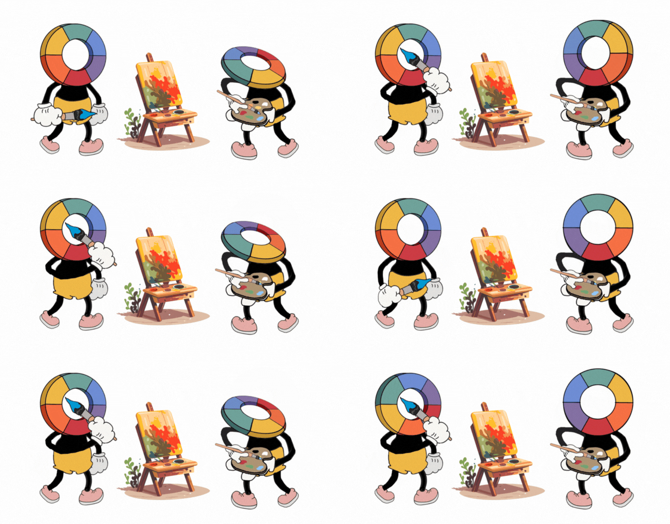
The color wheel is the foundation of color theory, organizing colors in a logical sequence. It consists of:
- Primary colors: Red, yellow, and blue
- Secondary colors: Orange, green, and purple (created by mixing primary colors)
- Tertiary colors: Created by mixing primary and secondary colors
When changing colors in GIFs, understanding the relationships between colors on the wheel can help you make harmonious choices rather than random ones.
Color Harmony: Creating Pleasing Combinations
Color harmony refers to arrangements of colors that are aesthetically pleasing. Common harmonious color schemes include:
Complementary Colors
Colors opposite each other on the color wheel (like blue and orange) create maximum contrast and visual impact. This scheme works well for GIFs where you want elements to pop or create energy.
Analogous Colors
Colors that sit next to each other on the color wheel (like blue, blue-green, and green) create a serene, unified look. This scheme works well for creating calm, cohesive GIFs.
Triadic Colors
Three colors equally spaced around the color wheel create a vibrant, balanced effect. This scheme is great for playful, energetic GIFs.
Monochromatic Colors
Different shades, tints, and tones of a single color create a sophisticated, unified look. This scheme works well for subtle, elegant GIFs.
Color Psychology: Evoking Emotion
Different colors evoke different emotional and psychological responses. When changing colors in your GIFs, consider what emotions you want to evoke:
- Red: Excitement, passion, urgency, attention
- Orange: Energy, enthusiasm, warmth, creativity
- Yellow: Optimism, clarity, cheerfulness, caution
- Green: Growth, harmony, freshness, safety
- Blue: Trust, calm, stability, professionalism
- Purple: Luxury, mystery, creativity, wisdom
- Pink: Playfulness, romance, tenderness, youth
- Brown: Reliability, comfort, earthiness, simplicity
- Black: Sophistication, power, elegance, formality
- White: Purity, cleanliness, simplicity, minimalism
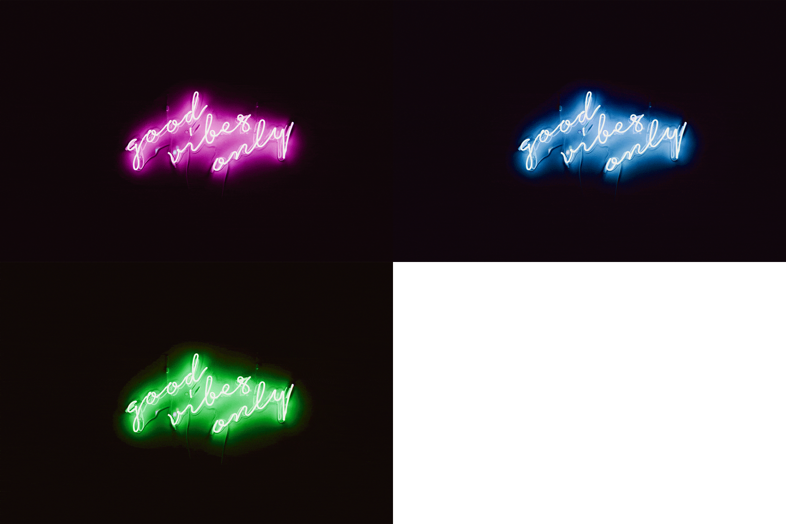
By strategically changing colors in your GIFs, you can shift the emotional impact of an animation to better suit your message.
Color Context: How Colors Interact
Colors don't exist in isolation—they're affected by surrounding colors. When changing colors in GIFs, consider:
Simultaneous Contrast
Colors appear different depending on the background against which they're viewed. A blue element will appear differently against a yellow background versus a purple one.
Visual Vibration
Some color combinations (particularly complementary colors at full saturation) can create an uncomfortable visual "vibration" when placed directly adjacent to each other. This can be intentionally used for attention-grabbing effects but should generally be avoided for comfortable viewing.
Practical Applications for GIF Color Changing
Creating Brand Consistency
When using our GIF Color Changer tool for branded content, replace key colors with your exact brand colors (using hex codes for precision). This creates visual consistency across all your materials.
Improving Accessibility
Enhance the readability and accessibility of informational GIFs by ensuring sufficient contrast between text and background elements. The Web Content Accessibility Guidelines (WCAG) recommend a minimum contrast ratio of 4.5:1 for normal text.
Setting the Right Mood
Adjust the overall color temperature of a GIF to better match your intended mood:
- Warm colors (reds, oranges, yellows) feel energetic, passionate, and attention-grabbing
- Cool colors (blues, greens, purples) feel calm, professional, and trustworthy
Creating Visual Hierarchy
Use color changes to guide the viewer's eye to the most important elements of your GIF. Elements with higher contrast or more saturated colors will naturally draw attention first.
Tips for Using Our GIF Color Changer with Color Theory in Mind
- Before changing colors, identify the color scheme of the original GIF and decide whether to maintain that scheme or create a new one
- Use a color wheel tool to help identify harmonious color combinations
- Consider the context where your GIF will be viewed—will it need to stand out against a specific background?
- For multiple color changes, plan your new color scheme before starting to ensure all new colors work well together
- Save iterations of your work to compare different color combinations
Conclusion
Color is a powerful communication tool that can transform the impact of your GIFs. By applying basic color theory principles when using our GIF Color Changer, you can create more intentional, effective, and visually appealing animations that better serve your communication goals.
Remember that while color theory provides useful guidelines, there's also room for creative experimentation. Sometimes breaking the "rules" can lead to unexpected and delightful results!


